.svg)


See a team's productive time slip in week two, not at month-end
Productive time and the productivity percentage, by person, team or organization, each with its percent change against the same period before it. You get a team and a date to go and ask about.

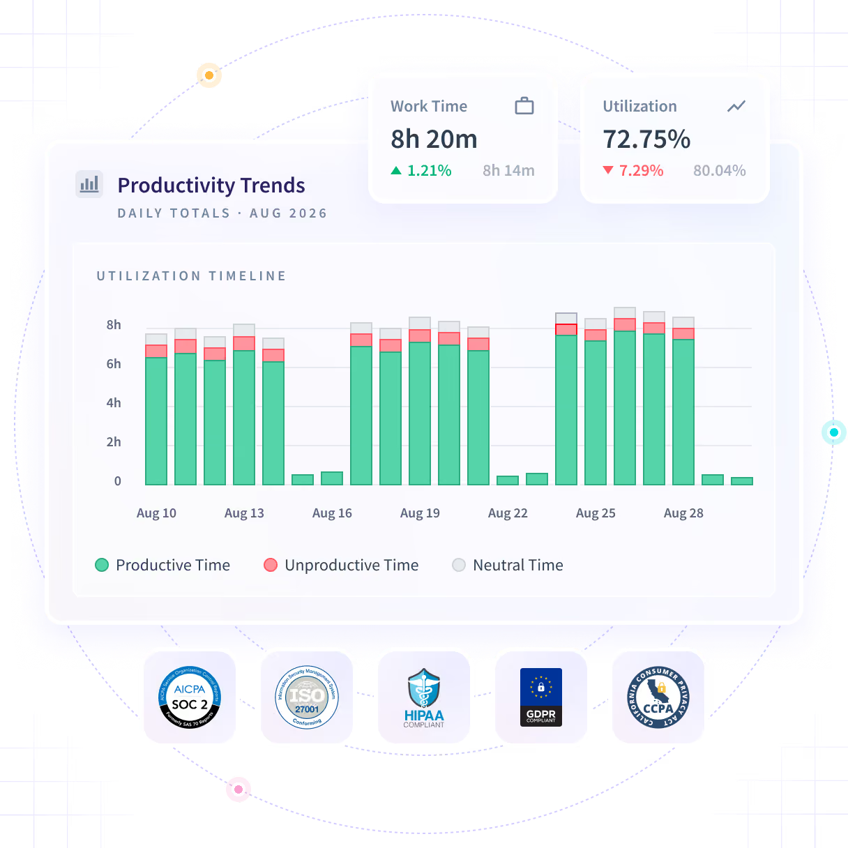











The dip shows up after it has cost you
A team that is slowing down feels slower for weeks before anything proves it. By the time a monthly report confirms the drop, the deadline is gone.

Read the direction, weeks before the report
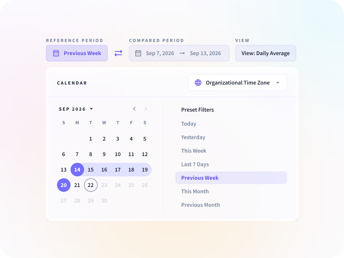
Each measure reports against the same-length period before it, so a slide in productive time shows up in week two rather than at month-end. Every trend filters to a team or a person.

Direction, not level
A single number reads as normal for that team. A change against the same-length period before it does not.

Week two, not month-end
A slide in productive time surfaces while the period is still running, rather than once the reporting cycle closes.

Filtered to one team
Every trend, ranking and chart filters by team or by person, so the read is specific enough to act on.

Productive is yours to define
Applications and sites are classified per team, so one team's core tool is not counted against another.
See where the hours went, and which way they are going
Work time split into productive, unproductive and idle, each with its change against the period before, a timeline showing when it turned, and rankings at both ends. Nowhere on it is there a single score.


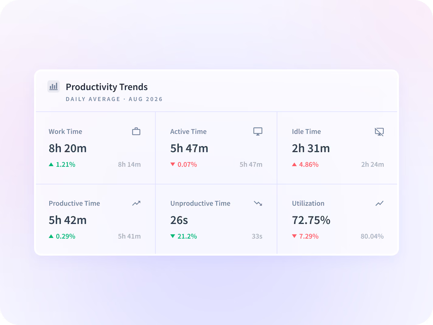
Work time split into productive, unproductive, idle, active, manual and neutral, plus the productivity percentage, for whichever team or person you filtered to.


Every number carries its percent change against the same-length period before it. Digital Estimating read productivity from 78% to over 90% across one measured period.


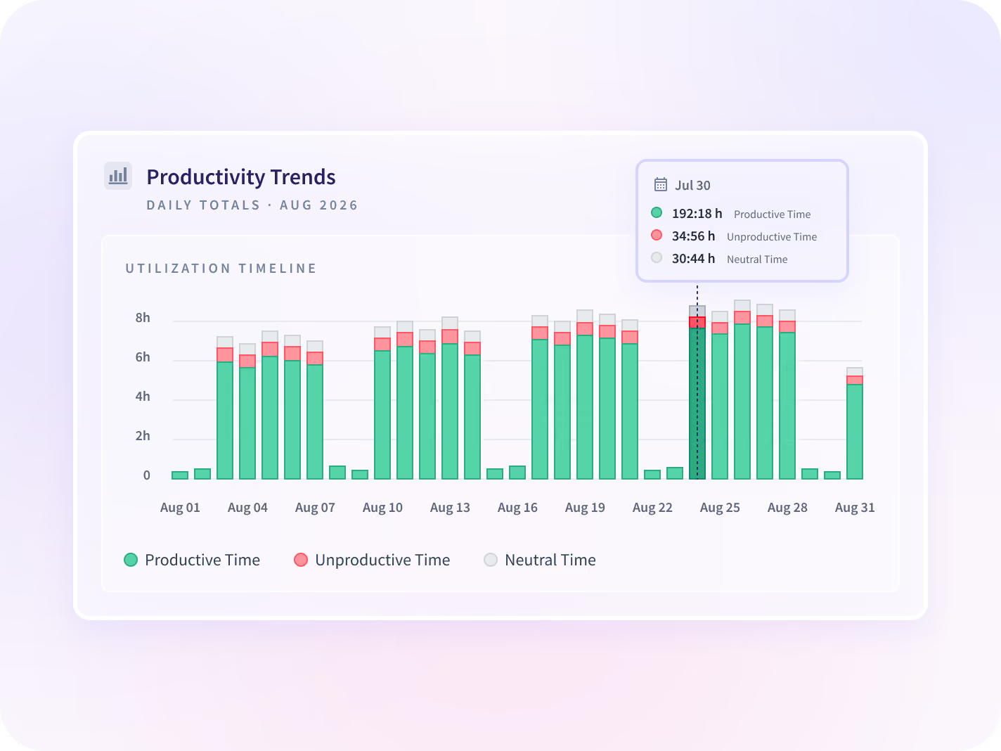
Cumulative activity plotted across the range, so the week a trend turned is visible rather than inferred from two monthly totals.


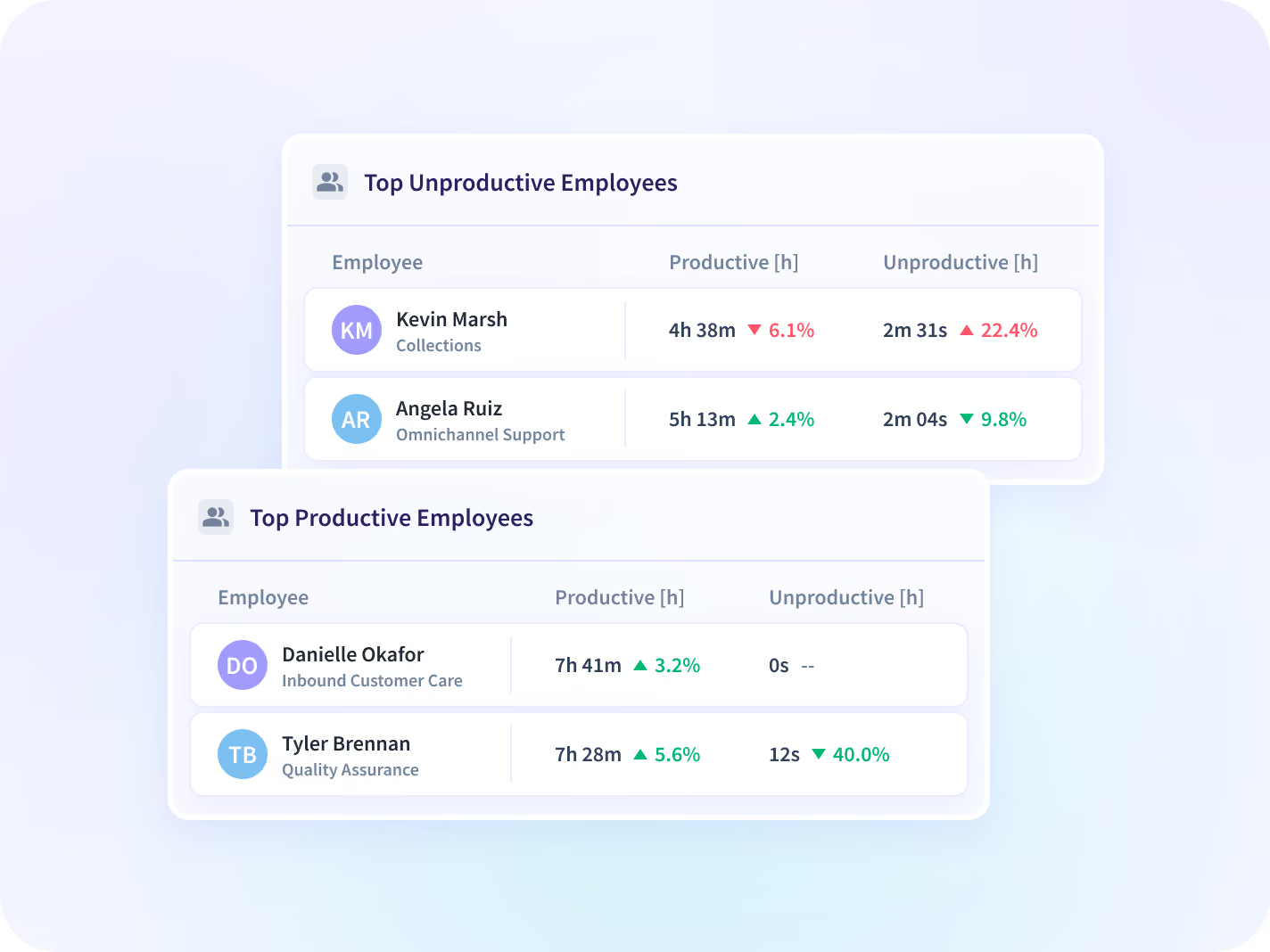
The most and least productive people, teams, applications and sites, ranked and sortable. That second list is the one worth agreeing on with HR before anybody opens it.
Explain the number that moved, the same week
A direction is a prompt, not an answer. Add meeting load, tool use and work setting to name what moved it, then price the answer as capacity and as cost per unit.

Communication Report
Whether the drop is meeting load, split into communication time and focus time by team. The most common explanation for a slide.

Apps & Website Usage
Which tools absorbed the difference, ranked by real use, so a trend has a named cause rather than a theory.

Location Insights
Whether the change follows a shift in work setting rather than in the team, compared across office, remote and hybrid days.

Workload Management
Where a dip is overflow: hours worked and after-hours activity by team, set next to the queue that team is carrying.

Operational Efficiency
The same movement priced as cost per unit, which is the number a delivery owner has to defend in the review.

Operations
The eight numbers read as capacity: who is covered, who is stretched, and what the next two weeks can hold.
Nobody waits for the exit interview or month-end
The month-end report as the first warning
Filter a trend to the team or the person carrying the overflow, and hold a specific conversation instead of setting a blanket policy.
Utilization and delivery dates held
The exit interview as the first data point
See a sustained drop in productive time alongside rising after-hours activity, at team level, while there is still something to change.
Workload balance
What a productivity number is built from
The eight measures come from application and website activity, never from its content. Findings are presented at team level by default, and the classification behind productive is yours to set before deployment.






Trusted by 5,000+ Teams Worldwide







Read the direction before month-end
Connected to the tools your teams already use
50+ integrations across the project, HR and development tools your teams already use. You can also talk to your work data with MCP connectors.


FAQ
By reading direction rather than level. Every number on the Productivity Trends report carries its change against the same-length period before it, so when productive time slips across two weeks it shows up in week two rather than at month-end. The numbers are measured as work happens, not reconstructed afterwards, and come from the desktop application at an interval you set. What you get is a team and a date to go and ask about, not a cause.
Productivity measurement is the practice of quantifying how work time converts into output. Insightful measures it as the share of work time spent in applications and on sites classified as productive for that team, reported as a trend rather than a single score. Farmers Insurance read theirs from the high 70s to 92% on that line. It makes the number exactly as good as the classification underneath it, and the classification is yours to set.
Productivity Trends is the report: eight measures and their direction over time. Productivity management is what a manager decides to do about them, and the use-case pages cover that half.
Yes. Every trend, ranking and chart filters by team or employee, and the Top 5 view ranks both the most and the least productive at each level. That second list is the one worth agreeing on with HR before anybody opens it.
You do, before deployment. Applications and websites are classified productive, unproductive or neutral per team, so a tool that is core work for one team is not counted against another.
Yes, by CSV. External KPI Import reads your own business metrics alongside activity data, so a trend can be judged against a number your organization already keeps. A live pipeline is in development; today it is a file somebody uploads.
No, and it does not claim to. The trend reports how work time was spent: productive, active and idle time, each against the period before. Sales, tickets closed and other results stay in the systems that hold them, so compare the trend with those numbers there.

