How to Use Burndown Charts to Boost Productivity

%20(1).png)

Project management in today’s climate is tough. Spinning all the plates necessary to deliver for your client was already a difficult enough task. But now, with everyone working remotely, it can feel like an impossible task. Optimizing remote team communication is something that many businesses will have wrestled with over the last twelve months. Luckily, the answer may be more simple than you first thought.
Well, not all your problems. You’re still going to have to understand the client's needs, put the work in, delegate tasks, overcome unforeseen obstacles along the way, and so on. Decent employee monitoring software can definitely help with a lot of this.
However, while burndown charts can’t necessarily fix everything, they can make a huge difference. They allow everyone you work with to see how much progress has been made, as well as how much more there is to go, keeping you on the right track.
What Are Burndown Charts?
By now, you’re probably wondering what we mean when we talk about “burndown charts”. So, let’s begin with the basics.
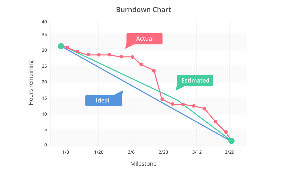
Burndown Charts are a device used as part of a wider project management strategy. They aren’t something that will be a one-stop-shop for all of your time-keeping or task-based goals. But, when integrated correctly, they can provide a useful illustration on how you, your team, or your business is performing.
They operate by showing the most effective way to complete a task from start to finish. With story points plotted down the “Y” axis and timescale plotted across the “X” axis, they are a neat, simple tool that allows you to keep track of your operational goals.
The particular way of working which is best suited to the use of burndown charts is something called “Agile” working. If you’re unfamiliar with this, a common description is a form of work that eradicates conventional boundaries, with the commonly-used tagline “anytime, any place, anywhere”.
But, as The Agile Organisation approach is keen to point out, there is a little more to it than just providing fluidity for colleagues with remote working and flexible hours. It speaks to a different approach to the work itself, encouraging innovation and building a more cooperative and communal experience for all involved. Burndown charts fit into this ethos by providing information openly, and meaning everyone in a team knows exactly what’s going on.
The Benefits of Using Burndown Charts
Now that we’ve looked at what burndown charts are, let’s investigate some of their benefits.
Accessible information
The most obvious benefit that burndown charts offer is that they are visual. Instead of having to wade through a lot of text to find out whether your project remains on track, burndown charts show things in a way that everyone should be able to interpret. It’s easy to tell if you’re keeping pace, moving quicker than expected, or falling behind. It’s also a great way to build trust between your team and management, reducing micromanagement and helping employees feel empowered in their own work.
Improved consistency
When introduced at the start of the project, burndown charts offer a great way to ensure that the targets remain consistent. This allows you to avoid having days where multiple parts of the project come to a head, and can distribute deadlines more effectively. This steadier approach cuts out any fluctuation, and is a great way to boost your productivity, as no one ever feels overwhelmed.
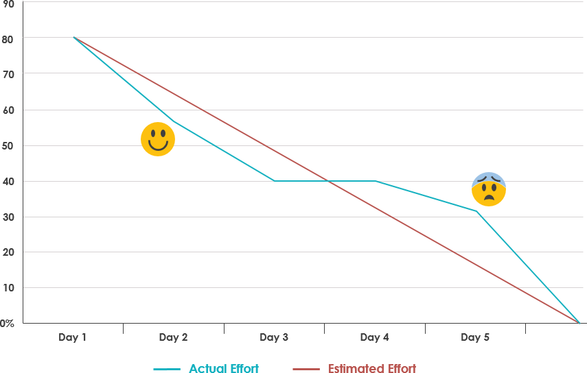
Easy to spot issues
On the occasion that things do go wrong, incorporating burndown charts into your strategy can help. Not only can they highlight the success of a team that is moving ahead of schedule, they can also flag up where productivity has taken a step back. When used alongside time tracking software, it can help to draw attention to the causes of this fall-off. Having this analysis, and using it to identify an issue before it gets out of control, is always going to be a welcome tool to have.
Having outlined the benefits of using burndown charts, let’s see how they actually allow for increased productivity.
How Burndown Charts Can Improve Productivity
With this in mind, burndown charts can be a simple way of integrating some structure into your operation, engaging remote employees, and keeping everyone on the same page.
Of course, just because they provide structure doesn’t mean that burndown charts are incapable of being flexible. The ability to customise these charts means that, should a client ask for something to be changed during a project, this can be easily handled.
Similarly, if you want to see how your colleagues compete with automated processes, you can easily keep track of how these processes impact your milestones on a burndown chart.
Potential Drawbacks
As with any change to operations, introducing burndown charts can have some drawbacks. Whilst they do highlight when productivity has been either ahead of or behind schedule, they aren’t able to illustrate any causality.
Similarly, the data it illustrates is only as good as the person, or persons, who are updating it. It is integral that the data introduced onto the burndown charts is accurate, and hasn’t been falsified in any way. It may make a team, or a colleague, look better or worse than they actually are, which helps no one.
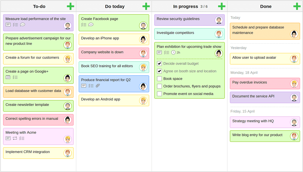
It’s important not to treat burndown charts as a comprehensive method of project management on their own. They are most effective when used alongside other methods - such as a Gantt Chart or a Kanban board. This means that it is often not a simple case of just introducing burndown charts to your way of working - you may need to make broader changes to your methods.
While burndown charts are flexible, they don’t have space to account for a backlog of tasks that a team may be experiencing. They also can’t always say which specific tasks have been completed, instead, showing a more general overview. For this, you may need additional strategies.
Conclusion
The digital industry is constantly changing. It will evolve today in ways that seemed unthinkable a year ago, and that pattern will continue for a very long time. Whether it’s updates to digital content protection, brand new project management strategies, or something we can’t even begin to expect, one thing we can count on is change.
The last year has been revolutionary for business all around the world. The changes made are so dramatic that, pre-COVID, they would have been hard to fathom. Luckily, introducing something as simple as a burndown chart into your operations really can make all the difference - ensuring you and your team remain as productive as possible.
.webp)
.webp)
.webp)